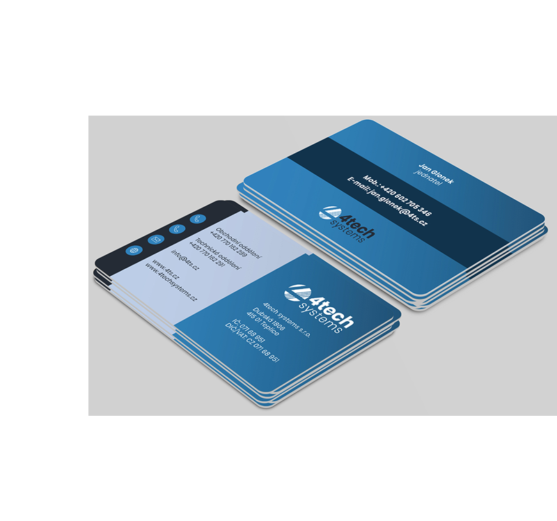
The business cards were designed using the same elements of visual identity we used on the website. Clearly given shades of blue and gray, round shapes and a set of icons - this is the visual communication of 4tech systems.

The business cards were designed using the same elements of visual identity we used on the website. Clearly given shades of blue and gray, round shapes and a set of icons - this is the visual communication of 4tech systems.

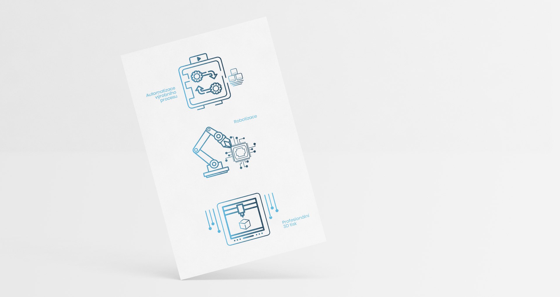
Besides the basic set of icons we created another 3 icons, which represent key areas of company's activity. In addition to textual information, we use this visual "abbreviation" that is understandable to everyone. Additionally, website has acquired new original elements that distinguish company from its competitors.
Besides the basic set of icons we created another 3 icons, which represent key areas of company's activity. In addition to textual information, we use this visual "abbreviation" that is understandable to everyone. Additionally, website has acquired new original elements that distinguish company from its competitors.

